Museum of Pop Culture 2021 annual report
The 2021 annual report was a challenge on three fronts: (1) the sheer amount of content that had to be included in 20 pages, (2) a tight timeline, as the process started very late in the following fiscal year, and (3) a large number of collaborators weighing in on content.
﹢Challenge 1: The museum did a LOT in 2021
The prior annual report was 60 pages long, and one of the goals of the 2021 report was to majorly condense it (both for print cost and for it to be more usable in Advancement meetings). While I love the inclusion of beautiful, full-spread photography in pieces like this, the constraints were such that I had to make peace with less negative space.
Role
Sole designer
Tools
InDesign, Illustrator, Photoshop
Duration
July 2022–September 2022
Team
Content leads: Michael Cole-Schwartz (Sr. Manager, Communications + Brand) and Errin Patton (Annual Fund Manager)
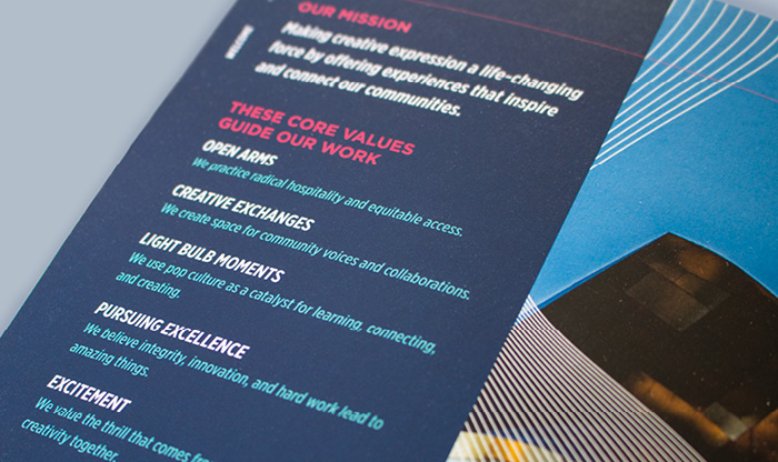
Some of the paragraph styles that carry throughout the publication, using Gotham Narrow and Gotham.
﹢Challenge 2: A tight timeline
We separated the report into two separate workflows: layout design and copy. While I believe that having content worked out in advance helps the designer to visually communicate the information being presented, we worked collaboratively on the structure up front, establishing the types of information that I would be designing and the system the report would live in.
By first establishing a system and adhering to a strict word count requirements per section (initially using lorem ipsum), we were able to fairly seamlessly progress on both design and copy.
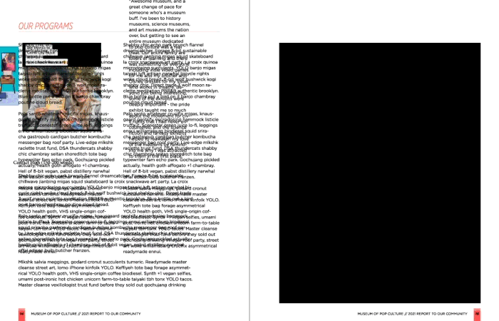
An evolution of a spread, starting with placeholder copy. Note the evolution of column structure, headline treatment, subhead treatment, and the introduction of the large panel on the left to mark the beginnng of a new section.
﹢Challenge 3: Tons of input
The content leads took ownership of communicating with the many, many stakeholders to make sure they had eyes on the content before it went to print. The process broke down into many rounds of edits, sometimes broken up into smaller sections to expedite the process. Some edits were quick, actionable copyedits, while larger questions on structure, order, or stylistic pieces that ran throughout the publication tended to be larger conversations with the team.
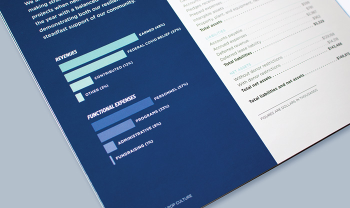
To make a table of numbers more understandable, I added a visualization. While past reports broke down Total Revenues and Contributed Revenues, I wasn't sure what story that was telling. What is the adueince looking for? What is the story we want to communicate?
Instead of two versions of Revenues, I thought it was more important to communicate income vs. spending — answering the question, how is MoPOP spending its money?


Designed + html’d by Carrie Ambo © 2024 ![]()