City Year website redesign
Redesigning the City Year website was a mammoth of a project, with a large working group, an external agency, multiple project leaders, and what felt like hundreds of rounds of approvals and discussions.
Because of my technical knowledge of html/css and experience with the previous website’s Drupal Content Management System (CMS) and userbase, I was able to help shape the website redesign to make it more usable.
The previous website was very dated, with a confusing navigation bar that lacked even a hover state. The redesign allowed us to take a modular approach to make building pages easier for our site users—it allowed for variation, but built a system to keep them consistent.
After the design stage, our team also worked long hours to migrate the thousands of pages of content into the new environment.
Role
In-house design lead
Tools
WordPress CMS, Illustrator, Photoshop
Duration
May 2019–March 2020
Team
City Year Marketing and Communications team, with project leadership by Sarah Cassell
Wireframing and development by Connelly Partners (agency partner)
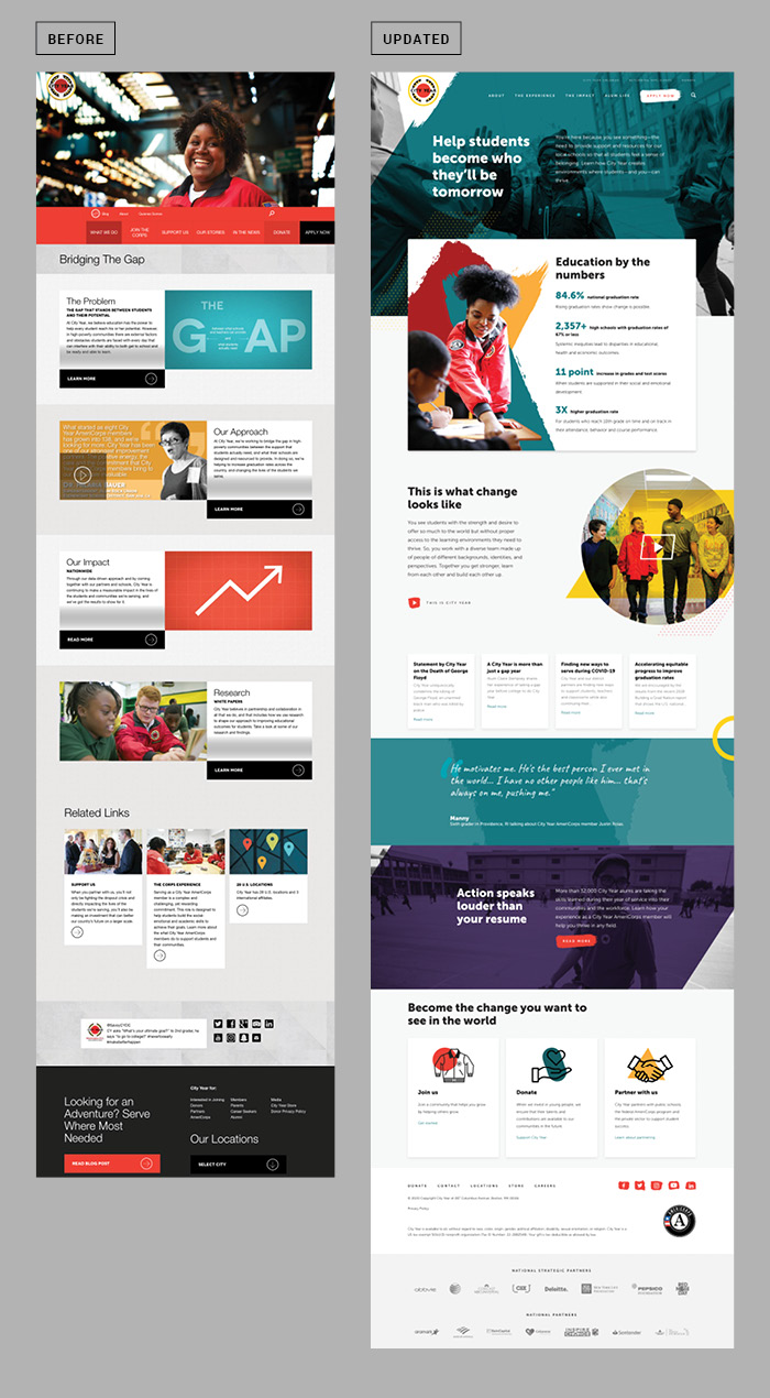
The previous website (on the left) had an excessively large red nav bar, with no transparency to what each category led to and a smaller secondary nav directly above it.
The alternating text/photo/CTA blocks throughout the pages also meant that the only indication of hierarchy was the order on the page itself.
Custom html solutions
In both the previous version of the website as well as the redesigned version, there were a lot of issues that begged for custom html solutions.
The following examples of website improvements were worked on page-by-page but often use responsive solutions using the CSS Grid framework already built into the site to pair information and make it more easily digestible.
Role
Design, front-end html + css
Tools
Photoshop, Adobe XD, Dreamweaver (html + css)
Duration
August 2017–July 2020
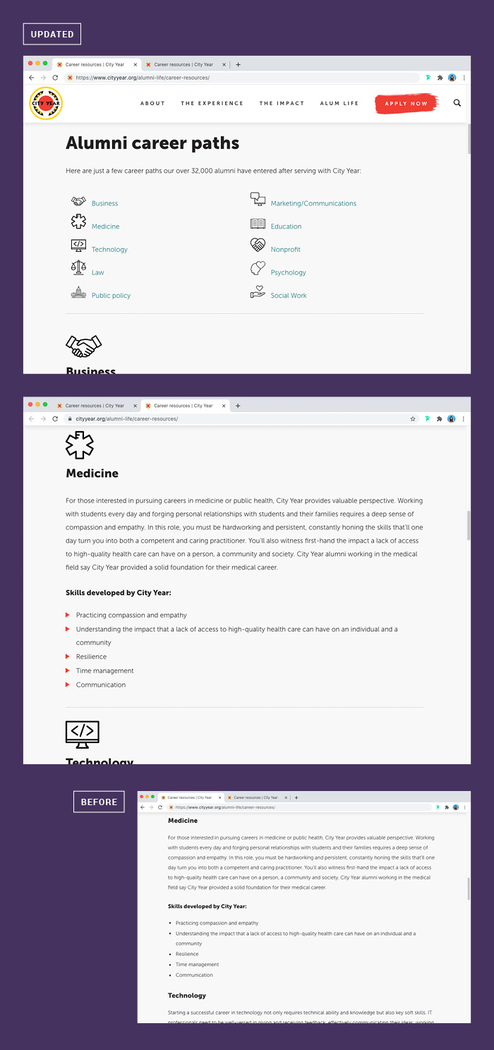
This Career Resources webpage began as an extensive list that the user had to scroll through in its entirety to find the career path relevant to them.
The two main things the page lacked were (1) hierarchy and (2) a method of guiding the user to what they were looking for.
I added relevant icons, made the categories larger, and added small line breaks between categories to more easily differentiate them from each other. I also added a ‘table of contents’ at the beginning to help the user find a relevant section that would scroll down to the corresponding anchor.
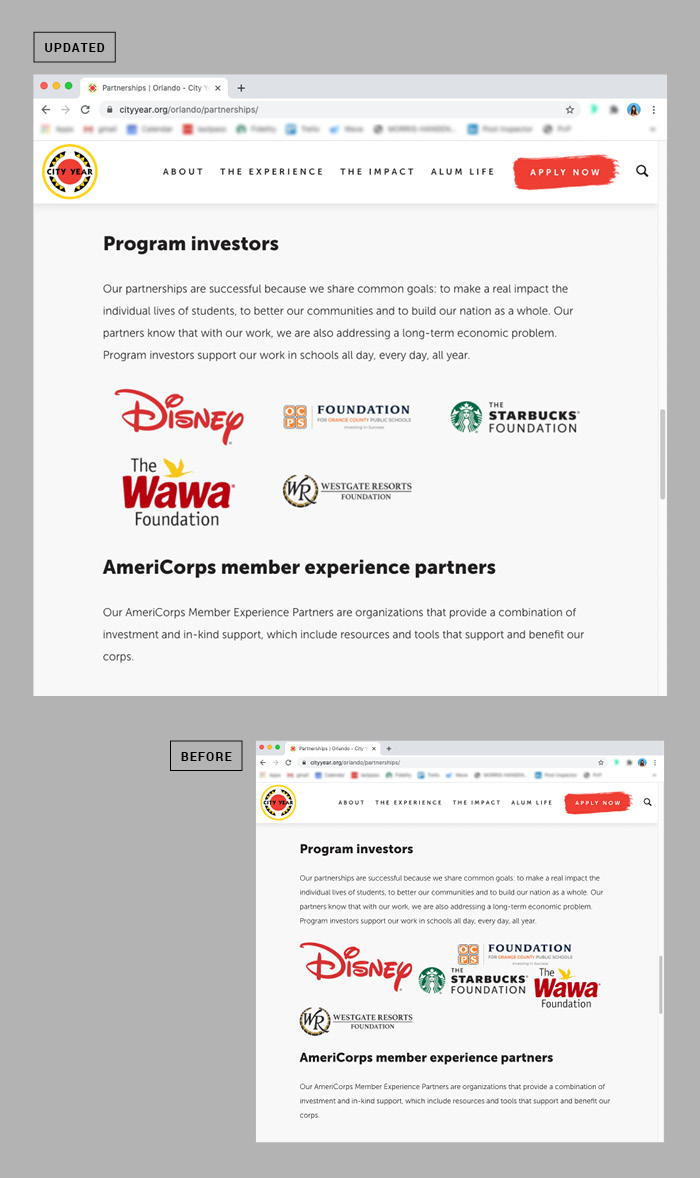
The challenge we faced when creating these ‘partnership’ pages was that we wanted to represent our sponsors in the best way possible—with professionalism.
The Rich Text Editor module on the website allowed us to upload logo files, but when uploaded, they either stacked on top of each other in one very long vertical column, or became very jumbled and disorganized. While some local users found ways to combat this by creating and uploading a single image with many logos, it was not a responsive solution, and also gave them the extra work of updating that image as changes in sponsorship arose.
After troubleshooting the issue, I was able to find a way to implement CSS Grid to make the images look good on mobile and desktop, and teach others on my team to implement the code I wrote.
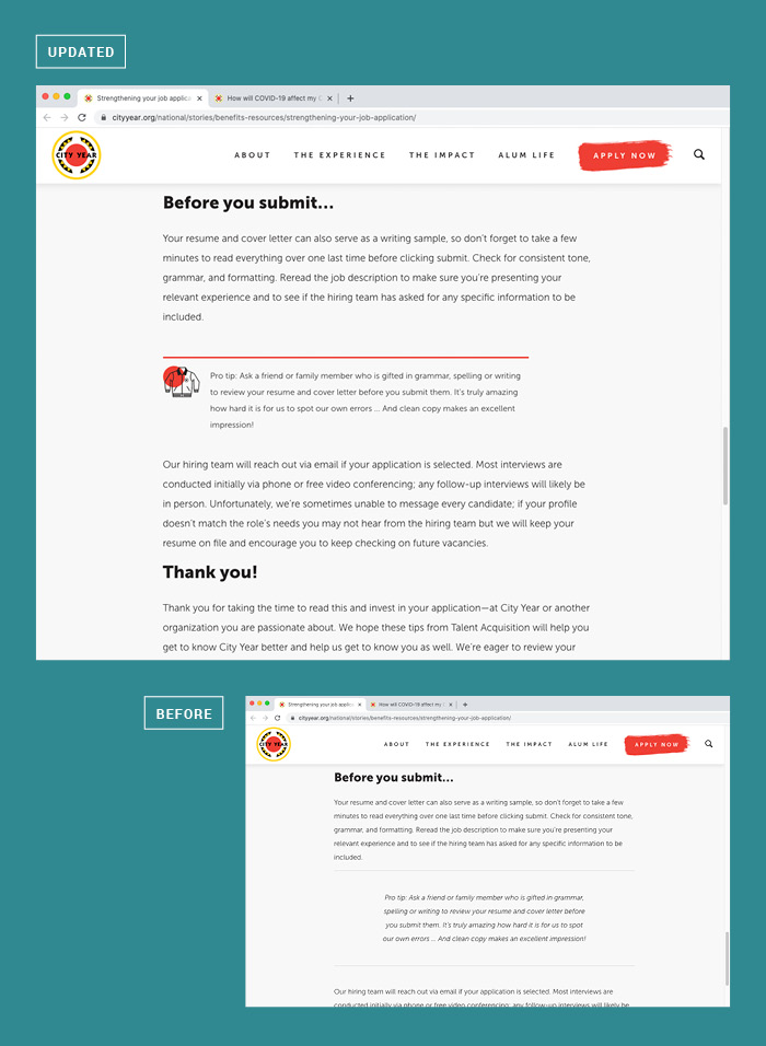
When the site was redesigned, we approved the typography for blockquotes within a blog (see image below: the text is offset between two horizontal lines, doesn't take up the full width of the blog, and is italicized).
However, as our blogs evolved, we realized we were relying on that blockquote styling for information that was relevant to the blog but not technically a pull-out quote. To visually differentiate these, I designed a different html snippet with an icon and a color bar to separate it from the body of the blog.


Designed + html’d by Carrie Ambo © 2024 